Creating Accessible Rich Sites With ARIA
Lindsey Kopacz, Front End Drupal Developer @littlekope0903What is ARIA?
Accessible Rich Internet Applications (ARIA) defines ways to make Web content and Web applications (especially those developed with AJAX and JavaScript) more accessible to people with disabilities.
Ok, What does that really mean?
- This essentially helps web content to work better with assistive technologies.
- This helps give more context to your content.
Question
Have you gone to your favorite sites, closed your eyes, and turned on Voiceover (or other screenreaders)?
If yes, another Question
How did you feel? Did you feel like you got the same context as a sighted user? Did you feel confused? Irritated? Happy?
How can ARIA Help?
Are there elements of my page that rely on Visual Cues to communicate Meaning?
Are there categories on a page that need context of what they are categorizing?
Are you forced to use <div>'s in your CMS?
Most popular ARIA attributes
role
- Used to describe widgets or structure. Very important in presence of
<div>'s - Popular Values:
article, banner, button, form, main, navigation, region
role example
<a role="button" href="/i/moments" class="js-nav js-tooltip js-dynamic-tooltip" data-component-context="moments_nav" data-nav="moments" data-placement="bottom" data-original-title=""> ... </a>
aria-describedby
- Identifies the element (or elements) that describes the object.
- Value: String that matches the id of the element used to describe it.
aria-labelledby
- Identifies the element (or elements) that labels the current element.
- Value: String that matches the id of the element used to label it.
The subtle difference...
							<p id="additional-label">This is additional label info</p>
<form action="">
<label for="basic">Normal Label Example</label>
<input id="basic" name="basic">
...
<label for="labelled" id="labelled-label">Labelled By Example</label>
<input id="labelled" name="labelled" aria-labelledby="labelled-label additional-label">
...
<label for="described">Described By Example</label>
<input id="described" name="described" aria-describedby="described-note">
<em class="note" id="described-note">This is a note about the field</em>
...
<label for="labelled-described" id="labelled-described-label">Labelled By and Described By Example</label>
<input id="labelled-described" name="labelled-described" aria-labelledby="labelled-described-label additional-label" aria-describedby="labelled-described-note">
<em class="note" id="labelled-described-note">This is a note about the field</em>
</form>
aria-expanded
- Indicates whether the element, or another grouping element it controls, is currently expanded or collapsed. Helpful for buttons that present sub items.
- Values:
true, false
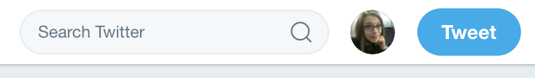
aria-expanded example
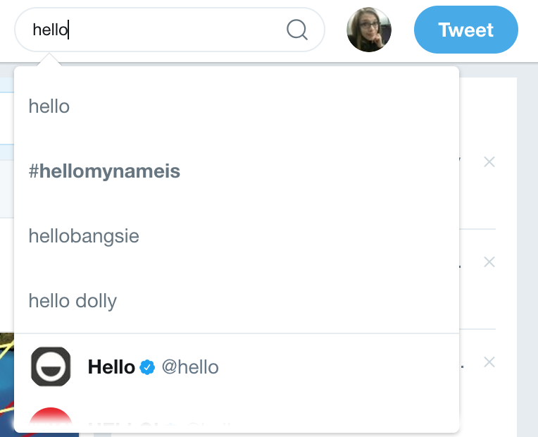
<input class="search-input" type="text" id="search-query" placeholder="Search Twitter" name="q" autocomplete="off" spellcheck="false" aria-autocomplete="list" aria-expanded="true" aria-owns="typeahead-dropdown-1" dir="ltr" style="direction: ltr; text-align: left;">
aria-expanded example
<input class="search-input" type="text" id="search-query" placeholder="Search Twitter" name="q" autocomplete="off" spellcheck="false" aria-autocomplete="list" aria-expanded="false" aria-owns="typeahead-dropdown-1" dir="ltr" style="direction: ltr; text-align: left;">
aria-haspopup
- Indicates that the element has a popup context menu or sub-level menu. Helps with menus that have submenu items that "pop up."
- Values:
true, false
aria-haspopup example
<a href="/settings/account" class="btn js-tooltip settings dropdown-toggle js-dropdown-toggle" id="user-dropdown-toggle" data-placement="bottom" rel="noopener" role="button" aria-haspopup="true" data-original-title="Profile and settings"> ... </a>
aria-hidden
- Indicates that the element and all of its descendants are not visible or perceivable to any user as implemented by the author. Additionally, it's helpful when there are items that impact styling, but have no semantic value.
- Values:
true, false
aria-hidden example
						<span class="text" aria-hidden="true">Home</span>
<span class="u-hiddenVisually a11y-inactive-page-text">Home</span>
<span class="u-hiddenVisually a11y-active-page-text">Home, current page.</span>
<span class="u-hiddenVisually hidden-new-items-text">New Tweets available.</span>
aria-label
- Defines a string value that labels the current element.
- Value: Any String that helps give better context to that element.
aria-label example

<div class="ProfileTweet-actionList js-actions" role="group" aria-label="Tweet actions"> ... </div>
aria-required
- Indicates that user input is required on the element before a form may be submitted.
- Helpful particularly in HTML4 forms, as HTML5 forms have
requiredattribute. - Values:
true, false
HTML5 vs. ARIA
- HTML5 makes much better use of semantic HTML than HTML4.
- ARIA can support HTML5, but if you can fix screenreader issues with semantic HTML, do it.
Human Testing is Valuable
- Sometimes Accessibility reports don't flag missing ARIA attributes.
- Recommend actually testing items with a screenreader and questioning if the site makes sense or not.
Build with Accessibility in Mind
- Use ARIA to enhance what you have, not to fix what is broken.
- When building, start with accessibility basics first, and use ARIA if items need additional context.
- If you need some introductions to accessibility concepts: I've presented on it.